Hayle Training Club
Redesign of Gym's existing WordPress website to align with their brand identity, and better reflect their services and experience.
Project Type: End-to-end responsive website
Role: UX/UI designer + frontend developer
Industry: Health, Fitness
Tools: Figma, WordPress
Duration: May - Aug 2025
Read
More
Introduction
Background
The client’s original website, while functional, lacked modern design elements and no longer aligned with the goals & offerings of Hayle Training Club.
It had also developed some issues as a result of not being maintained. This redesign focused on addressing the visual, structural, and technical issues
while aligning the site with Hayle Training Club’s new branding and offerings.
Objectives
- Reflect new branding and visual identity.
- Introduce new offerings and implement supporting SEO.
- Simplify user pathways to enhance user experience and engagement.
- Improve site performance and mobile responsiveness.
Scope of Work
- Redesign current web pages design & layout.
- Updating current web pages content & imagery.
- Design of new web pages for offerings not currently advertised.
- Integration of Shopify storefront.
- Implementation of new brand identity.
Understanding the Client
Brand Identity
The client supplied their new logo, which served as the foundation for the project’s colour palette. Black and gold were retained from the gym’s previous branding
to maintain continuity throughout and beyond the rebrand. White was introduced as a high-contrast option for dark backgrounds, whilst sand was selected to provide
a softer yet visually impactful tone for larger design elements.
Sand
#DBCBAF
Gold
#C78F30
White
#FFFFFF
Black
#000000
Target Audience
Personas were established to inform key functional and visual improvements to the existing client website, ensuring the redesign addressed real user needs. Each persona’s
goals and needs guided my decisions on the navigation structure, content hierarchy, and feature placement, to drive a more intuitive and efficient user experience when I
began prototyping the redesign.
Persona A
Current gym member, looking to utilise other services at the gym.
Goals:
- Explore other services available at their current gym.
- Renew gym membership.
- Check gym timetable.
Needs:
- Gym facilities listed on an easy-to-read web page.
- Membership options easy to find and access.
- Timetable easy to find and access.
- Mobile-friendly pages to check membership and timetable whilst on-the-go.
Problems with Current Site:
- Current membership page is content-heavy and confusing to understand membership options.
- Available facilities are not listed on website.
Persona B
Local teacher, interested in going to the gym on their commute.
Goals:
- Explore facilities, services, and memberships available.
- Find opening times and timetable.
- Learn about different classes available.
Needs:
- Gym facilities, services, and opening times listed on easy-to-read web pages.
- Membership options easy to find and access.
- Timetable easy to find and access.
- Information available about classes to make informed decision about joining.
Problems with Current Site:
- Available facilities are not listed on website.
- Current membership page is content-heavy and confusing to understand membership options available.
- Multiple pages highlighting information about CrossFit and no other services.
Prototyping the Redesign
I prototyped the redesign in Figma, which allowed for interactive previews of the new layout and features. The prototype was tested by both the client and a selection of gym users,
giving me valuable feedback that refined the site’s usability and ensured my final design would meet the real-world needs of it’s exact target audience.
User testing focused on core tasks such as booking a class, navigating the timetable, and finding information about memberships and facilities. Observing how users interacted with
the prototype highlighted which elements felt intuitive and which caused hesitation. Their feedback guided the adjustments needed to the navigation, content hierarchy, and mobile
responsiveness to help ensure the site would feel simple and efficient for both first-time visitors and returning members.
Improvements to be made during the site build:
- Timetable needs to be more digestible on mobile.
- Mobile menu as a slide out with options clearer.
- Our facility page content condensed into list of key points and gallery.
The Big Site Build
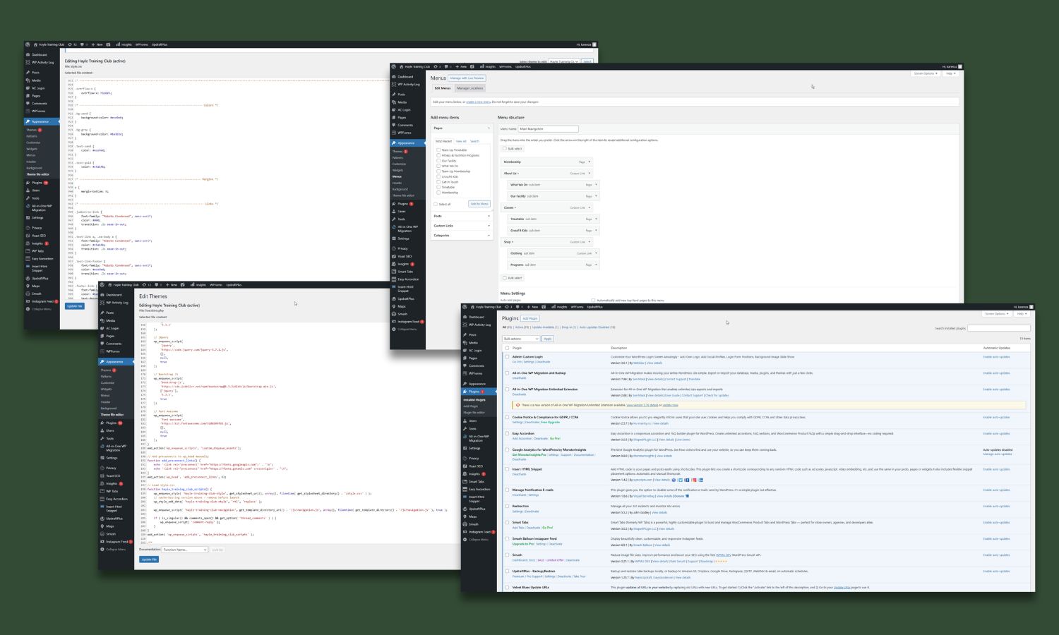
The website redesign was developed in WordPress, starting from a clone of the existing site to preserve some of the unchanged structure and content. I developed a custom theme to match the new styling and replicate essential functionality, enabling faster build times without sacrificing quality. I incorporated plugins very selectively, to ensure added functionality where required whilst maintaining optimal site performance and loading speeds.
Organisation Matters
Since a clone of the existing site was used to preserve the unchanged structure and content that also meant all the files, plugins, and required updates were also present on the backend of the redesign. Therefore, I organised and streamlined the site’s backend to improve performance, security, and maintainability for myself moving forward.
36 Inactive plugins removed
400+ Unused media files removed
v6.8.2 WordPress updated
An Unexpected Change
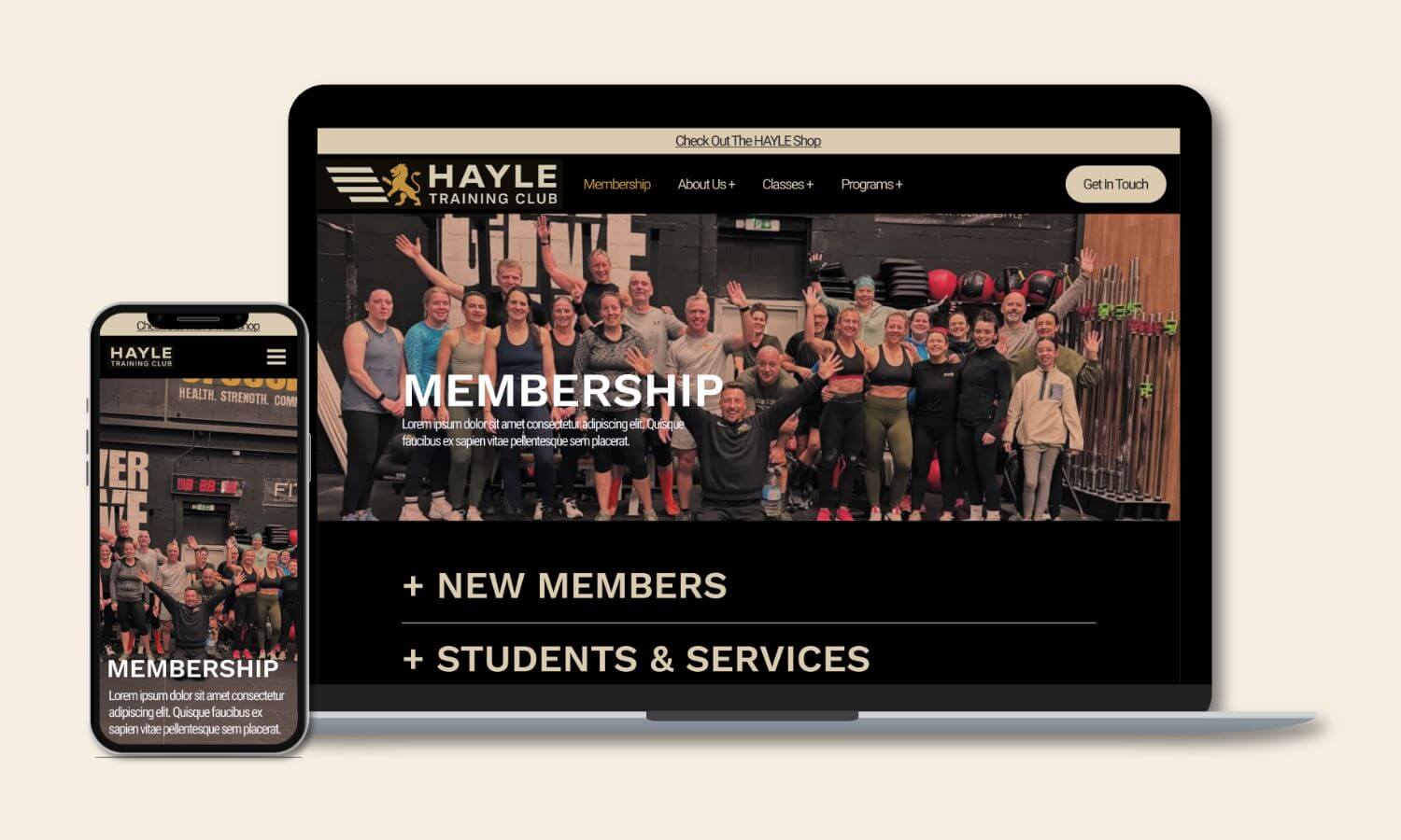
As with any project that is sticking to it’s timeline, something has to change, for this project it was the colour scheme. The client wanted to try out black on white, feeling that dark backgrounds wouldn’t remain consistent with the look of the gym space. They supplied an updated logo for me to create a revised colour scheme. White became the primary background, while the black was softened to a dark grey to reduce harsh contrast. The sand tone was adjusted to a cooler hue for section differentiation, and the gold was brightened to serve as a striking accent on the lighter background.
Sand
#ECE9E0
Gold
#C5A14B
White
#FFFFFF
Dark Grey
#1A1B1D
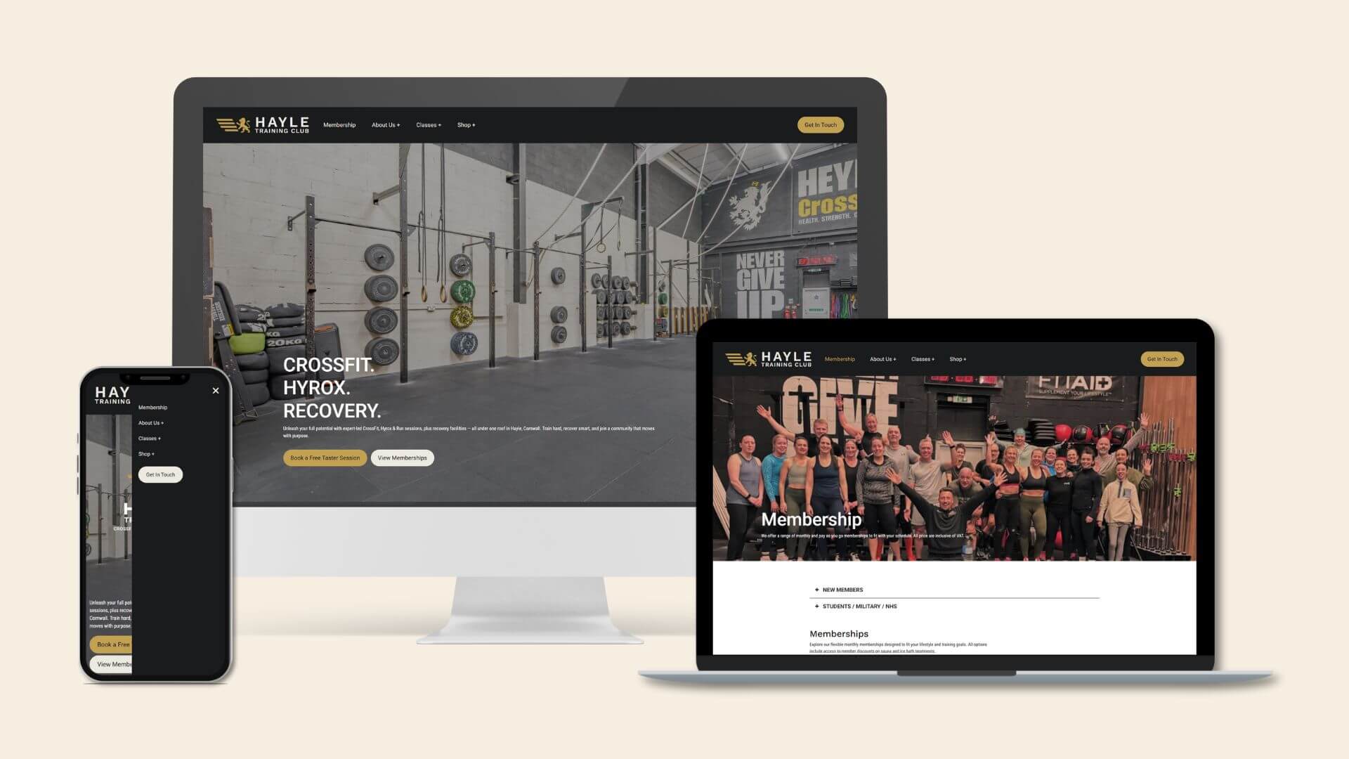
The Final Solution
The redesigned website delivers a clean, modern, and user-friendly experience that aligns with the gym’s updated brand identity. Every design decision, from the accessible colour palette to functionality,
was informed by user needs, client goals, and performance considerations, resulting in a visually appealing and highly functional site.
This project is currently on hold whilst the client's gym space undergoes a refurbishment and is expected to go live soon. You can check out the demo site below.